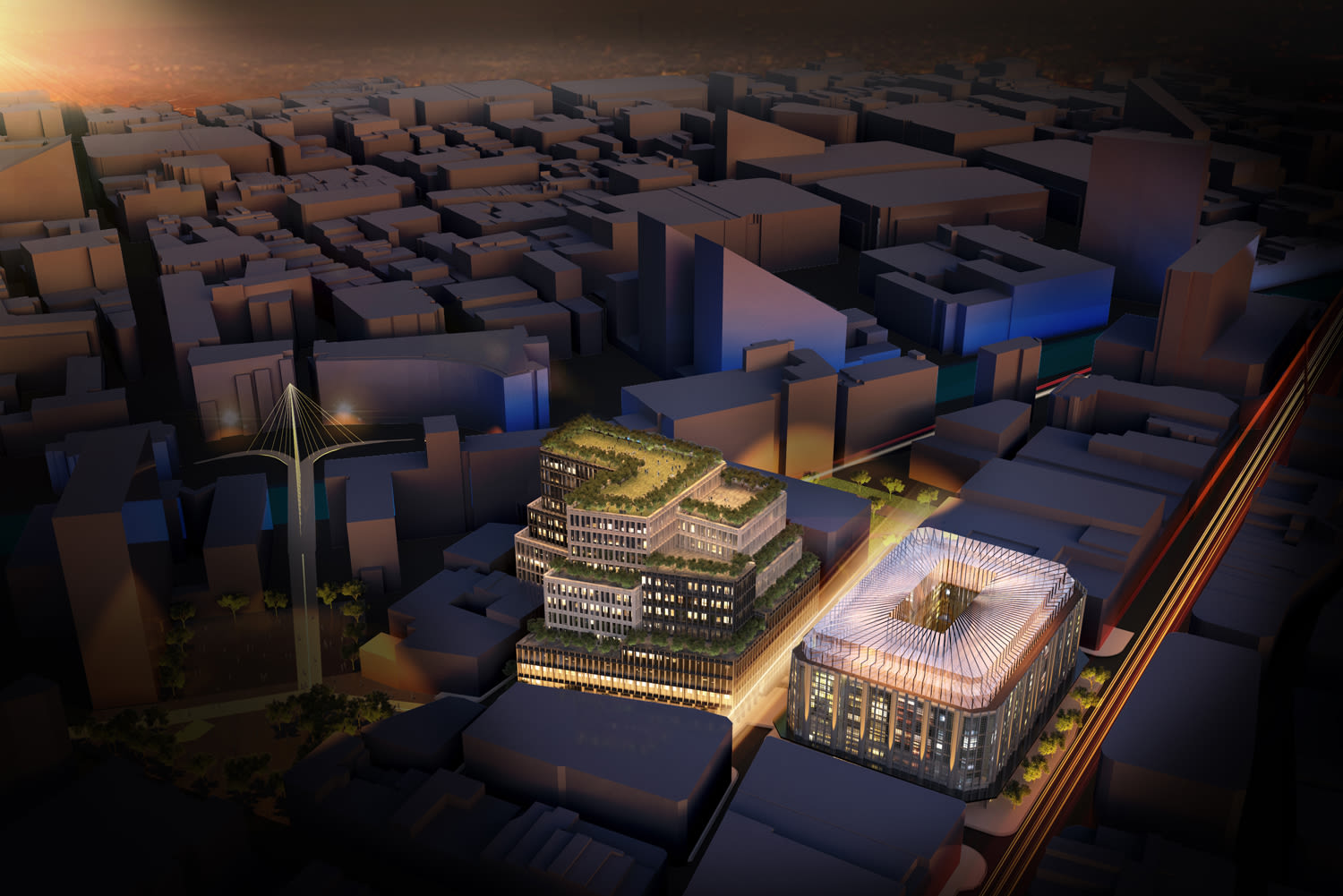
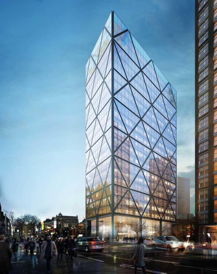
This project aims to create a new world-class cultural quarter for Manchester, anchored by the refurbished and revitalised Grade II listed Art-Deco Kendals Building, and a state of the art new office building – with acres of green terraces and the very best in wellness and sustainability standards.
Creating the new 'Kendals Quarter'
The intention of the project was to transform the Kendals site, located on Deansgate, the retail and commercial heart of Manchester, into a world class mixed use development for the city. The scheme is underpinned by a clear value proposition and proposes a commercially viable, robust and timely planning application which will revive an important historic asset, the Kendals Building, with new uses, while also creating a new interlinked office building to increase local supply of high quality workspace - all wrapped by new public realm.
Bringing life and activity back to the site
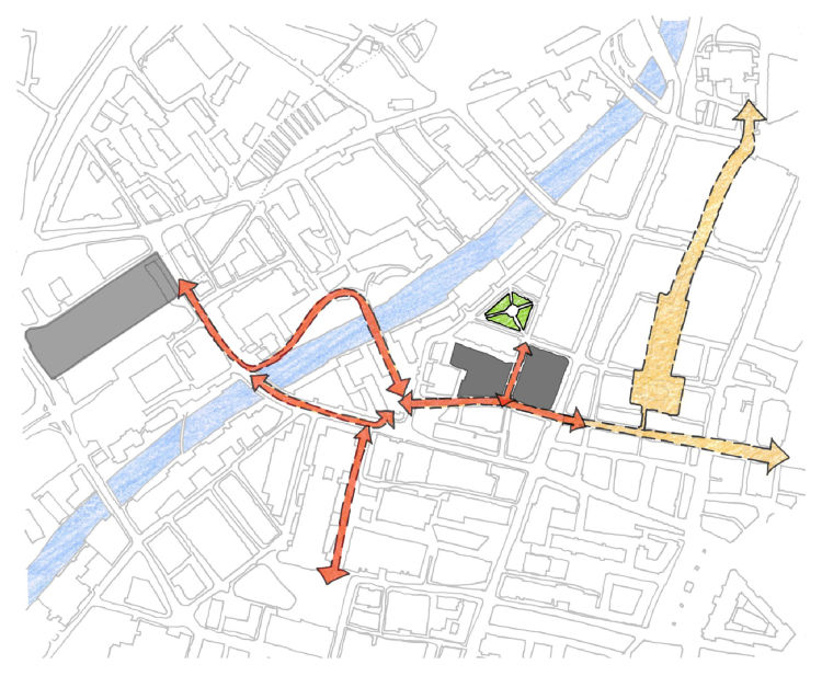
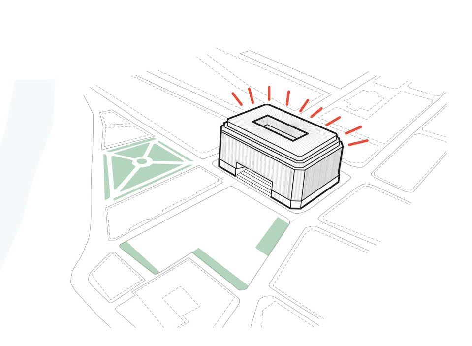
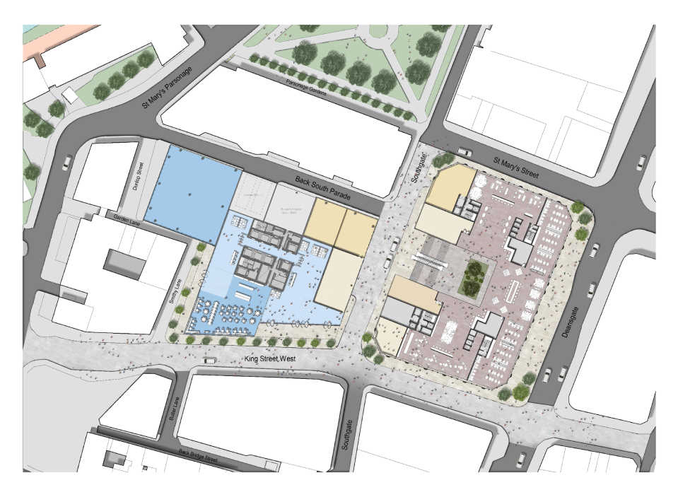
At the centre of the site is the striking modernist Art Deco Grade II listed Kendals Building, built in 1939 by J. S. Beaumont. The building's Portland limestone façade, punctuated by distinctive vertical windows in slices of greenish glass cutting through the stone is so distinctive, that architectural historian Pevsner, noted that the building is “unlike his [Beaumont's] usual work, or anything else in Manchester". Formerly a department store, the building will be revived to become the centrepiece of a vibrant new quarter containing a concentration of new uses, public squares and spaces for residents and visitors to the city to enjoy and interact. Our proposals also elevate the public realm surrounding the site by introducing new greening and planting and extending the shared pedestrian/car zone of King Street West across Deansgate to connect with St Mary’s Parsonage, Trinity Bridge and to Salford Central Rail Station. In addition, our proposals makes significant urban improvements by linking Salford Central to the heart of Manchester for the first time, dramatically increasing the value and connectivity of this part of the city.
Shaping the massing
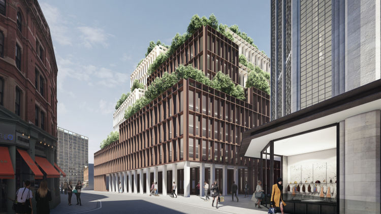
The new office building is intended to be a complementary but distinct part of the new Kendals quarter - providing high quality office space and flexible floorplates for a range of tenants. The new building is sensitive to both to its neighbouring context and to the listed Kendals Building, while showcasing the very best in wellness and tenant amenity and contemporary design. To chime with the scale of surrounding buildings, a datum was introduced to the building's massing, aligned to the height of adjacent buildings, with a second horizontal datum aligned to the height of the Kendals building. These interventions effectively 'split' the envelope of the office building along both axes, helping to reduce the perception of its bulk and mass.
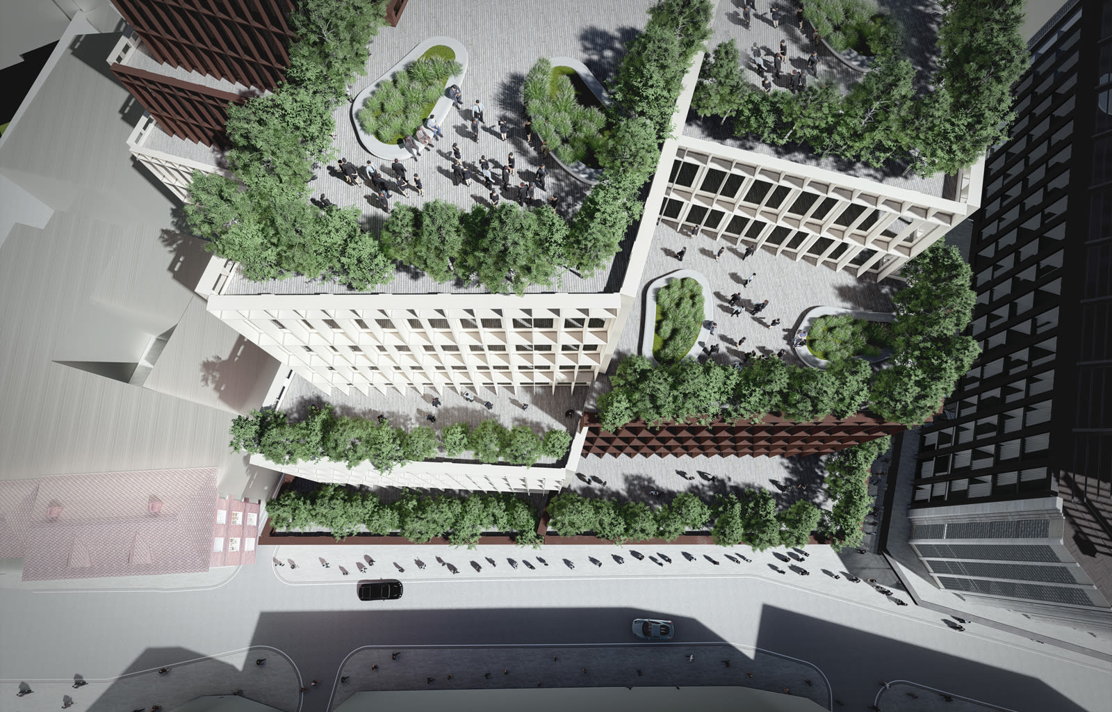
The western façades of the office building are stepped back progressively to soften the silhouette on the skyline, while along King Street West, the façades are again stepped to respect and open up views towards the heritage buildings along the road. Every floor enjoys an outdoor terrace amenity, increasing the value of each floor and ensuring the building will be highly desirable to not just the first tenant, but to all future tenants. Sweeping colonnades anchor the building to the street level, enhancing the building's entrances and bringing a bit of drama to the street.
A complementary addition to a revived Manchester icon
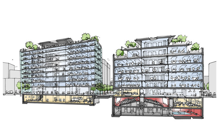
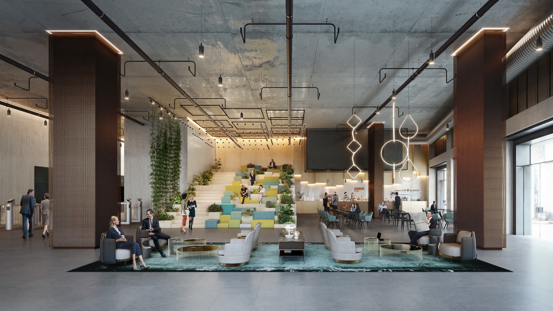
Breathing new life into and securing a long term sustainable new use for the Kendals Building was a key aim of the project, with the new vibrant ‘Kendals quarter' drawing life and activity back to the area, reminiscent of its heyday. The ground floor uses in the neighbouring new office building are designed to complement the Kendal Building's change of use, from retail to hotel and residential, by providing high quality, flexible office space, as well as 'third space' in the lobby, space which can be appropriated for events of more social functions such as impromptu meetings, break out spaces and meeting places - extending the life of the building from the day into the night.
Benchmarked against competitors
An extensive benchmarking exercise was undertaken to ensure the design of the new office building will be highly attractive to prospective tenants - and a more compelling than local competitor products. AFK's initial review of the market revealed a lack of good sized floor plates in the area, and a number of competing office buildings with cores that prevented tenants from efficiently fitting-out their workplaces. To ensure tenant attractiveness of the new building, specific core design principles were adopted to elevate the efficiency of the new building. These included: a 'clean skin core' where service risers do not feature on the external core wall, allowing tenants to extend their fit-out up against the core. Another principle was 'taking all elevators to ground' so there are no transfer floors or double-decker lifts; as well as 'no boots on the floor' approach, meaning all service modules are internalised in the core and configured to ensure that service personnel do not need to enter the secure line of a floor plate when servicing the building.
Efficient and attractive
The floor plates of the new office building are designed to be highly effective workplace, and to outperform competitor products, and attractive to a range of tenants. They are also highly flexible and can cater for tenants who may be taking a whole floor or partial floor, as the floor plates can be easily subdivided into four smaller tenant domains. Additionally, tenants who wish to take multiple floors could be accommodated through the introduction of an atrium to improve their inter-floor connectivity and staff engagement.
